
design & art direction
Thursday, 20 October 2011

Wednesday, 19 October 2011


Visual Communication: Typography / Design Research Project
I have been tasked with researching, and presenting information about designer and artist Robert Indiana.

Source : Wikipedia
Robert Indiana (born September 13, 1928) is an American artist associated with the Pop Art movement.
Robert Indiana was born Robert Clark in New Castle, Indiana. His family relocated to Indianapolis, where he graduated from Arsenal Technical High School. He moved to New York City in 1954 and joined the pop art movement, using distinctive imagery drawing on commercial art approaches blended with existentialism, that gradually moved toward what Indiana calls "sculptural poems".
In 1962, Eleanor Ward's Stable Gallery hosted Robert Indiana's first New York solo exhibition. He has since enjoyed solo exhibitions at over 30 museums and galleries worldwide. Indiana's works are in the permanent collections of numerous museums, including Museum of Modern Art, New York;Whitney Museum of American Art, New York; Metropolitan Museum of Art, New York; Stedelijk Museum, Schiedam, The Netherlands; Carnegie Institute, Pittsburgh; Detroit Institute of Art, Michigan; Baltimore Museum of Art, Maryland; Brandeis Museum, Waltham, Massachusetts; Albright-Knox Gallery of Art, Buffalo, New York; San Francisco Museum of Modern Art, California, the Hirshhorn Museum in Washington D.C.; Institute of Contemporary Art, University of Pennsylvania, Philadelphia, Pennsylvania; and the Los Angeles County Museum, California, among many others.
Indiana's work often consists of bold, simple, iconic images, especially numbers and short words like EAT, HUG, and, his best known example, LOVE.

Indiana's iconic work LOVE was first created for a Christmas card for the Museum of Modern Art in 1964 and later was included on an eight-cent United States Postal Service postage stamp in 1973, the first of their regular series of "love stamps." The first serigraph/silk screen of "Love" was printed as part of an exhibition poster for Stable Gallery in 1966 (See "Love and The American Dream: The Art of Robert Indiana"). A few examples of the rare image, in bold blue and green with a red bottom announcing "Stable May 66" are known to exist. 25 of these, without the red announcement, were signed and dated on the reverse by Indiana. Sculptural versions of the image have been installed at numerous American and international locations. In 1977 he created a Hebrew version with the four letter word Ahava (אהבה "love" in Hebrew) using Cor-ten steel, for the Israel Museum Art Garden in Jerusalem, Israel.
In 1995, Indiana created a 'Heliotherapy Love' series of 300 silk screen prints signed and numbered by the artist, which surrounds the iconic love image in a bright yellow border. These prints are the largest official printed version of the Love image.

In 2008, Indiana created an image similar to his iconic LOVE (letters stacked two to a line, the letter "o" tilted on its side), but this time showcasing the word "HOPE," and donated all proceeds from the sale of reproductions of his image to Democrat Barack Obama's presidential campaign, raising in excess of $1,000,000. A stainless steel sculpture of HOPE was unveiled outside Denver's Pepsi Center during the 2008 Democratic National Convention. The Obama campaign sold T-shirts, pins, bumper stickers, posters, pins and other items adorned with HOPE. Editions of the sculpture have been released and sold internationally and the artist himself has called HOPE "Love's close relative".
For Valentine's Day 2011 Indiana created a similar variation on LOVE for Google, which was displayed in place of the search engine site's normal logo.

Other well-known works by Indiana include: his painting the unique basketball court formerly used by the Milwaukee Bucks in that city's U.S. Cellular Arena, with a large M shape taking up each half of the court; his sculpture in the lobby of Taipei 101, called 1-0(2002, aluminum), using multicoloured numbers to suggest the conduct of world trade and the patterns of human life; and the works he created in the aftermath of the September 11, 2001 attacks and exhibited in New York in 2004 called the Peace Paintings.
Indiana has lived as a resident in the island town of Vinalhaven, Maine since 1978, where he lives in a historic Odd Fellows Hall named "The Star of Hope".
Indiana's best known image is the word love in upper-case letters, arranged in a square with a tilted letter O. The iconography first appeared in a series of poems originally written in 1958, in which Indiana stacked LO and VE on top of one another. Then in a painting with the words "Love is God". The red/green/blue image was then created for a Christmas card for the Museum of Modern Art in 1964. It was put on an eight-cent US Postal Service postage stamp in 1973, the first of their regular series of "love stamps."


 Serif
Serif
Clarendon is an English slab-serif typeface that was created in England by Robert Besley for the Fann Street Foundry in 1845. Due to its popularity, Besley registered the typeface under Britain's Ornamental Designs Act of 1842. The patent expired three years later, and other foundries were quick to copy it. Clarendon is considered the first registered typeface, with the original matrices and punches remaining at Stephenson Blake and later residing at the Type Museum, London. They were marketed by Stephenson Blake as Consort, though some additional weights (a bold and italics) were cut in the 1950s.
It was named after the Clarendon Press in Oxford. Designs for wood type were made from the mid 1840s on. The typeface was reworked by the Monotype foundry in 1935. It was also revised by Hermann Eidenbenz and Edouard Hoffmann in 1953, Freeman Craw as Craw Clarendon, an American version released by American Type Founders, in 1955, and by Aldo Novarese as Egizio, complete with italics, in 1958, among others.


Although Robert Indiana came to prominence during the 1960s as a Pop artist, his concerns have always differed greatly from those of his contemporaries. National and cultural identity have always held more interest for Indiana than the mass media and trappings of consumer culture. As a self-styled American icon, his influences, methods, and outlook mirror that of his native country. What distinguishes Indiana from his "Pop" colleagues is the depth of his personal engagement with his subject matter: America and American life. (left: The Figure Five, 1963, oil on canvas, 60 x 50 inches. National Museum of American Art, Smithsonian Institution, 1984.51) Indiana's works all speak to the vital forces that have shaped American culture in the late half of the 20th century: personal and national identity, political and social upheaval and stasis, the rise of consumer culture, and the pressures of history. In a word, the American Dream.
4-Star Love
Indiana, best known for his 'Love' series.
Source : Wikipedia
Robert Indiana (born September 13, 1928) is an American artist associated with the Pop Art movement.
Robert Indiana was born Robert Clark in New Castle, Indiana. His family relocated to Indianapolis, where he graduated from Arsenal Technical High School. He moved to New York City in 1954 and joined the pop art movement, using distinctive imagery drawing on commercial art approaches blended with existentialism, that gradually moved toward what Indiana calls "sculptural poems".
In 1962, Eleanor Ward's Stable Gallery hosted Robert Indiana's first New York solo exhibition. He has since enjoyed solo exhibitions at over 30 museums and galleries worldwide. Indiana's works are in the permanent collections of numerous museums, including Museum of Modern Art, New York;Whitney Museum of American Art, New York; Metropolitan Museum of Art, New York; Stedelijk Museum, Schiedam, The Netherlands; Carnegie Institute, Pittsburgh; Detroit Institute of Art, Michigan; Baltimore Museum of Art, Maryland; Brandeis Museum, Waltham, Massachusetts; Albright-Knox Gallery of Art, Buffalo, New York; San Francisco Museum of Modern Art, California, the Hirshhorn Museum in Washington D.C.; Institute of Contemporary Art, University of Pennsylvania, Philadelphia, Pennsylvania; and the Los Angeles County Museum, California, among many others.
Indiana's work often consists of bold, simple, iconic images, especially numbers and short words like EAT, HUG, and, his best known example, LOVE.
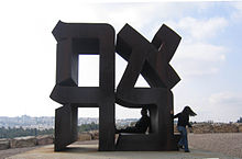
'Love' sculpture in Manhattan
Ahava (אהבה "love" in Hebrew),
Cor-ten steel sculpture, 1977
Indiana's iconic work LOVE was first created for a Christmas card for the Museum of Modern Art in 1964 and later was included on an eight-cent United States Postal Service postage stamp in 1973, the first of their regular series of "love stamps." The first serigraph/silk screen of "Love" was printed as part of an exhibition poster for Stable Gallery in 1966 (See "Love and The American Dream: The Art of Robert Indiana"). A few examples of the rare image, in bold blue and green with a red bottom announcing "Stable May 66" are known to exist. 25 of these, without the red announcement, were signed and dated on the reverse by Indiana. Sculptural versions of the image have been installed at numerous American and international locations. In 1977 he created a Hebrew version with the four letter word Ahava (אהבה "love" in Hebrew) using Cor-ten steel, for the Israel Museum Art Garden in Jerusalem, Israel.
In 1995, Indiana created a 'Heliotherapy Love' series of 300 silk screen prints signed and numbered by the artist, which surrounds the iconic love image in a bright yellow border. These prints are the largest official printed version of the Love image.
'HOPE' - Designed for Barak Obama presidential campaign
In 2008, Indiana created an image similar to his iconic LOVE (letters stacked two to a line, the letter "o" tilted on its side), but this time showcasing the word "HOPE," and donated all proceeds from the sale of reproductions of his image to Democrat Barack Obama's presidential campaign, raising in excess of $1,000,000. A stainless steel sculpture of HOPE was unveiled outside Denver's Pepsi Center during the 2008 Democratic National Convention. The Obama campaign sold T-shirts, pins, bumper stickers, posters, pins and other items adorned with HOPE. Editions of the sculpture have been released and sold internationally and the artist himself has called HOPE "Love's close relative".
For Valentine's Day 2011 Indiana created a similar variation on LOVE for Google, which was displayed in place of the search engine site's normal logo.
Indiana's Google homepage logo for Valentine's day, 2011
Other well-known works by Indiana include: his painting the unique basketball court formerly used by the Milwaukee Bucks in that city's U.S. Cellular Arena, with a large M shape taking up each half of the court; his sculpture in the lobby of Taipei 101, called 1-0(2002, aluminum), using multicoloured numbers to suggest the conduct of world trade and the patterns of human life; and the works he created in the aftermath of the September 11, 2001 attacks and exhibited in New York in 2004 called the Peace Paintings.
Indiana has lived as a resident in the island town of Vinalhaven, Maine since 1978, where he lives in a historic Odd Fellows Hall named "The Star of Hope".
Indiana's best known image is the word love in upper-case letters, arranged in a square with a tilted letter O. The iconography first appeared in a series of poems originally written in 1958, in which Indiana stacked LO and VE on top of one another. Then in a painting with the words "Love is God". The red/green/blue image was then created for a Christmas card for the Museum of Modern Art in 1964. It was put on an eight-cent US Postal Service postage stamp in 1973, the first of their regular series of "love stamps."
'LOVE' Stamp, 1973
Clarendon (typeface used in LOVE)
It took me a while to track down what typeface Indiana used for 'Love' but the closest match is below. All of the letters seem to fit, apart from the O which people speculate that he manually altered the counter size to create the desired effect.
It took me a while to track down what typeface Indiana used for 'Love' but the closest match is below. All of the letters seem to fit, apart from the O which people speculate that he manually altered the counter size to create the desired effect.
Category
Serif Classification
Slab serif
Designer(s)
Robert Besley
Foundry
Fann Street
Clarendon is an English slab-serif typeface that was created in England by Robert Besley for the Fann Street Foundry in 1845. Due to its popularity, Besley registered the typeface under Britain's Ornamental Designs Act of 1842. The patent expired three years later, and other foundries were quick to copy it. Clarendon is considered the first registered typeface, with the original matrices and punches remaining at Stephenson Blake and later residing at the Type Museum, London. They were marketed by Stephenson Blake as Consort, though some additional weights (a bold and italics) were cut in the 1950s.
It was named after the Clarendon Press in Oxford. Designs for wood type were made from the mid 1840s on. The typeface was reworked by the Monotype foundry in 1935. It was also revised by Hermann Eidenbenz and Edouard Hoffmann in 1953, Freeman Craw as Craw Clarendon, an American version released by American Type Founders, in 1955, and by Aldo Novarese as Egizio, complete with italics, in 1958, among others.
The font was used extensively by the government of the German Empire for proclamations during World War I, and was also common in wanted posters of the American Old West.
Oral history interview with Robert Indiana, 1963 Sept. 12-Nov. 7
A somewhat lengthy interview with Robert Indiana in 1963. To long to list directly on my blog but definably gives a fascinating insight into his life, and his work. Can be found at: http://www.aaa.si.edu/collections/interviews/oral-history-interview-robert-indiana-12936

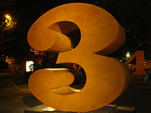
Numbers 1-0 is a public artwork by American artist Robert Indiana, located at the Indianapolis Museum of Art (IMA), which is near downtown Indianapolis, Indiana. This series of sculptures is composed of 10 brightly painted numerical digits, each made of aluminum and set on its own base. Their construction took place at the former Lippincott Foundry in North Haven, Connecticut from 1980 to 1983.These ten objects are fabricated from sheets of cut and rolled aluminum into the forms of Arabic numerals, or “numbers.” Each number is 8' tall, 8' wide, and 4' deep, and weighs between 600 and 1000 lbs.[ Each number is painted with a two-color scheme: one color for the front and back sides, and then a separate color for the interior and exterior panels. The range of colors includes four shades of blue and red; three shades of green; two shades of orange, yellow, and white; and one shade of purple, grey, and black.
Description
The numbers are not exhibited in numerical order; they have been arranged by the artist to represent dates of personal significance. Each number is mounted onto a custom-fit aluminum base (resting on a center post) that rests on a square concrete block. All numbers are approximately the same total height and width, but vary in linear design depending on the shape of the number.
The artist’s name, year of production (varies from 1980-1983), copyright symbol, and the foundry mark (Lippincott) have been stamped into either the right or left side of each number.
The sculpture’s appeal and accessibility spring from the artist’s use of everyday material—numbers, rich colors, and the typography of advertising. Though Indiana is best known as a Pop art artist, his color choices—vivid hues and contrasts between different surfaces—and the manner in which the numbers are arranged together—staggered, overlapping, nonlinear—reflect his interest in Op-Art.
Historical information
The numbers were conceived as a 1980 drawing made in commemoration of the 20th anniversary of Melvin Simon & Associates (now called Simon Property Group). Indiana accepted the commission to make the drawing specifically because it was attached to the creation of a series of corresponding, three-dimensional sculptures. At the time they were largest and most important commission of Indiana’s career. They were made with the artist’s stipulation that they eventually be donated to the IMA.
Indiana’s original concept was inspired by a 19th-century print “The Life and age of man, stages of man's life from the cradle to the grave” which was given to Indiana in the 1970s.

In the 2002 New York Times preview of several Indiana exhibits that took place in 2003, the numbers and their colors were identified to represent the stages of man in this way:
1, red and green: birth;
2, blue and green: infancy
3, orange and blue: youth
4, red and yellow: adolescence
5, blue and white: pre-prime of life
6, red and green: prime of life
7, blue and orange: early autumn
8, orange and purple: autumn
9, yellow and black: warning
0, shades of gray: death.
Indiana had been working with the 10 numbers two-dimensionally since the late 1950s, but Numbers 1-0 was his first opportunity to realize them in sculptural form. He sees each number as being both an abstract idea and a representation of the physical presence of numbers in life; he associates many significant memories from his own life with numbers.
Indiana has fabricated at least one other version of the Numbers 1-0 that is similar in both size and color to the IMA set; however, they are slightly smaller than the originals and the colors are slightly different. A set that was fabricated in 1996, were on view in New York City (on Park Avenue between 60th Street and 70th Street) in early 2003.
⅓ scale versions of Numbers 1-0 were on view at the Paul Kasmin gallery as part of his 2008 “Hard Edge” gallery show, which was planned in honor of the artist's 80th birthday ([Planned in honor of the artist's 80th birthday reference]). The colors used for these numbers were similar to, but not exactly like the IMA’s or the 1996 versions.
Indiana also fabricated another 8' tall set of the numbers with un-coated Cor-ten steel for his 2006 exhibition in Madrid]
Location history
Each of the original 10 sculptures was intended to first be displayed at a different Simon Property Group property; in fall 1981, the 1 was on view at the Simon headquarters in Merchants Place, and the 2 was soon to be on view at Two West Washington. It is also known that the 1 and 2 appeared at the Children’s Museum in 1982, in honor of director Mildred Compton’s 21 years of service. Also in that year the 1, 2, and 3 were used at the awards podium for the 1982 National Sports Festival, which was held in Indianapolis.
Although the entire series was accessioned into the IMA's collection in 1988, only the 6 was put on display at the museum at the time, because of an expansion project taking place. The rest of the numbers were added to the outdoor display in 1992.
In 2005, the IMA building and grounds underwent an extensive renovation, which included rearrangement of the outdoor sculpture collection. The numbers were moved to their second and current location during this time. Indiana designed the presentation of the sculptures, arranging them in pairs of personal significance which he detailed in a 2003 drawing. The series of sculptures is located just east of the IMA's main parking lot, near the intersection of Michigan Road and 38th Street in Indianapolis, Indiana.
Acquisition
The numbers were acquired by the IMA in 1988 as a gift of Melvin Simon & Associates (now Simon Property Group).
The series of sculptures Numbers 1-0 was surveyed in July of 1993 as part of the Smithsonian American Art Museum's Inventories of American Painting and Sculpture database, and it was considered to be well maintained.[11] According to the IMA's Blog, Numbers 1-0 is washed annually by the IMA Conservation Department.
Love and the American Dream: The Art of Robert Indiana
June 24 - October 17, 1999
Love and the American Dream: The Art of Robert Indiana is the first exhibition to explore the two central themes of Robert Indiana's artistic career. Organized by the Portland Museum of Art, Love and the American Dream includes more than 70 paintings, sculpture, and prints from museums and private collections across the country.
Oral history interview with Robert Indiana, 1963 Sept. 12-Nov. 7
A somewhat lengthy interview with Robert Indiana in 1963. To long to list directly on my blog but definably gives a fascinating insight into his life, and his work. Can be found at: http://www.aaa.si.edu/collections/interviews/oral-history-interview-robert-indiana-12936
An interesting video interview with Robert Indiana
Numbers 1-0
Description
The numbers are not exhibited in numerical order; they have been arranged by the artist to represent dates of personal significance. Each number is mounted onto a custom-fit aluminum base (resting on a center post) that rests on a square concrete block. All numbers are approximately the same total height and width, but vary in linear design depending on the shape of the number.
The artist’s name, year of production (varies from 1980-1983), copyright symbol, and the foundry mark (Lippincott) have been stamped into either the right or left side of each number.
The sculpture’s appeal and accessibility spring from the artist’s use of everyday material—numbers, rich colors, and the typography of advertising. Though Indiana is best known as a Pop art artist, his color choices—vivid hues and contrasts between different surfaces—and the manner in which the numbers are arranged together—staggered, overlapping, nonlinear—reflect his interest in Op-Art.
Historical information
The numbers were conceived as a 1980 drawing made in commemoration of the 20th anniversary of Melvin Simon & Associates (now called Simon Property Group). Indiana accepted the commission to make the drawing specifically because it was attached to the creation of a series of corresponding, three-dimensional sculptures. At the time they were largest and most important commission of Indiana’s career. They were made with the artist’s stipulation that they eventually be donated to the IMA.
Indiana’s original concept was inspired by a 19th-century print “The Life and age of man, stages of man's life from the cradle to the grave” which was given to Indiana in the 1970s.
"The Life and Age of Man-Stages of Man's Life, from the Cradle to the Grave," by James Baillie
In the 2002 New York Times preview of several Indiana exhibits that took place in 2003, the numbers and their colors were identified to represent the stages of man in this way:
1, red and green: birth;
2, blue and green: infancy
3, orange and blue: youth
4, red and yellow: adolescence
5, blue and white: pre-prime of life
6, red and green: prime of life
7, blue and orange: early autumn
8, orange and purple: autumn
9, yellow and black: warning
0, shades of gray: death.
Indiana had been working with the 10 numbers two-dimensionally since the late 1950s, but Numbers 1-0 was his first opportunity to realize them in sculptural form. He sees each number as being both an abstract idea and a representation of the physical presence of numbers in life; he associates many significant memories from his own life with numbers.
Cor-Ten version of 3 & 4 in Madrid, 2006
Indiana has fabricated at least one other version of the Numbers 1-0 that is similar in both size and color to the IMA set; however, they are slightly smaller than the originals and the colors are slightly different. A set that was fabricated in 1996, were on view in New York City (on Park Avenue between 60th Street and 70th Street) in early 2003.
⅓ scale versions of Numbers 1-0 were on view at the Paul Kasmin gallery as part of his 2008 “Hard Edge” gallery show, which was planned in honor of the artist's 80th birthday ([Planned in honor of the artist's 80th birthday reference]). The colors used for these numbers were similar to, but not exactly like the IMA’s or the 1996 versions.
Indiana also fabricated another 8' tall set of the numbers with un-coated Cor-ten steel for his 2006 exhibition in Madrid]
Location history
Each of the original 10 sculptures was intended to first be displayed at a different Simon Property Group property; in fall 1981, the 1 was on view at the Simon headquarters in Merchants Place, and the 2 was soon to be on view at Two West Washington. It is also known that the 1 and 2 appeared at the Children’s Museum in 1982, in honor of director Mildred Compton’s 21 years of service. Also in that year the 1, 2, and 3 were used at the awards podium for the 1982 National Sports Festival, which was held in Indianapolis.
Although the entire series was accessioned into the IMA's collection in 1988, only the 6 was put on display at the museum at the time, because of an expansion project taking place. The rest of the numbers were added to the outdoor display in 1992.
In 2005, the IMA building and grounds underwent an extensive renovation, which included rearrangement of the outdoor sculpture collection. The numbers were moved to their second and current location during this time. Indiana designed the presentation of the sculptures, arranging them in pairs of personal significance which he detailed in a 2003 drawing. The series of sculptures is located just east of the IMA's main parking lot, near the intersection of Michigan Road and 38th Street in Indianapolis, Indiana.
Acquisition
The numbers were acquired by the IMA in 1988 as a gift of Melvin Simon & Associates (now Simon Property Group).
The series of sculptures Numbers 1-0 was surveyed in July of 1993 as part of the Smithsonian American Art Museum's Inventories of American Painting and Sculpture database, and it was considered to be well maintained.[11] According to the IMA's Blog, Numbers 1-0 is washed annually by the IMA Conservation Department.
Love and the American Dream: The Art of Robert Indiana
June 24 - October 17, 1999
Love and the American Dream: The Art of Robert Indiana is the first exhibition to explore the two central themes of Robert Indiana's artistic career. Organized by the Portland Museum of Art, Love and the American Dream includes more than 70 paintings, sculpture, and prints from museums and private collections across the country.


Although Robert Indiana came to prominence during the 1960s as a Pop artist, his concerns have always differed greatly from those of his contemporaries. National and cultural identity have always held more interest for Indiana than the mass media and trappings of consumer culture. As a self-styled American icon, his influences, methods, and outlook mirror that of his native country. What distinguishes Indiana from his "Pop" colleagues is the depth of his personal engagement with his subject matter: America and American life. (left: The Figure Five, 1963, oil on canvas, 60 x 50 inches. National Museum of American Art, Smithsonian Institution, 1984.51) Indiana's works all speak to the vital forces that have shaped American culture in the late half of the 20th century: personal and national identity, political and social upheaval and stasis, the rise of consumer culture, and the pressures of history. In a word, the American Dream.
4-Star Love
The Portland Museum of Art recently announced the acquisition of an important early oil painting by Robert Indiana entitled 4-Star Love, which will be included in the exhibition. 4-Star Love is the first painting to include the word that would make Indiana a household name. This diminutive work is part of a series of small-scale paintings (12 x 11 1/8 inches) focused on single words (others in this series included paintings entitled Joy and Fun) the artist executed in 1961. These works, which the artist calls the "Bijoux" paintings, were exhibited in the early 1960s, and many entered private collections. 4-Star Love was acquired by Eleanor Ward, Indiana's dealer during the 1960s, and has not been shown publicly since that time.
The position of the four stars in 4-Star Love (two on top, two on bottom) prefigures the design of the artist's world-famous composition, Love. This format was a common feature of the artists' early paintings, many of which included circles or other geometric forms assembled in a square. The four stars in this painting appear to allude to a system of rating (as in restaurants and hotels) ranking the quality of love. The star has also been read as a symbol of America, nationalism, fame, or a self-portrait of the artist.
4-Star Love is a vibrant and significant painting that deepens our understanding of Robert Indiana's art and his place in American art history. The painting was donated to the Portland Museum of Art by Todd R. Brassner in memory of Doug Rosen, a close friend of Indiana' s and Long-time Vinalhaven resident who passed away in 1998.
The American Dream is the cornerstone of Indiana's mature work. The roots of this powerful concept pervaded the artist's Depression-era childhood, as well as the social and political aspirations of the United States during his formative years as an artist (1940s-1960s). It was the theme of his first major painting (sold to The Museum of Modern Art in 1961), as well as a series of works that continues to the present (the artist finished The Seventh American Dream in 1998). Indiana's process of reconstructing and redefining the American Dream has taken many forms: his political paintings, like The Confederacy: Alabama (1965); his literary paintings, like The Calumet (1961); and his autoportraits and investigations of celebrity and identity, like The Metamorphosis of Norma Jean Mortenson (1963-1967). (left: The Beware-Danger American Dream No. 4, 1963, oil on canvas, four panels, assembled: 102 1/4 x 102 1/4 inches, Hirshorn Museum and Sculpture Garden, Smithsonian Institution, Gift of Joseph H. Hirshorn Foundation)
The Portland Museum of Art recently announced the acquisition of an important early oil painting by Robert Indiana entitled 4-Star Love, which will be included in the exhibition. 4-Star Love is the first painting to include the word that would make Indiana a household name. This diminutive work is part of a series of small-scale paintings (12 x 11 1/8 inches) focused on single words (others in this series included paintings entitled Joy and Fun) the artist executed in 1961. These works, which the artist calls the "Bijoux" paintings, were exhibited in the early 1960s, and many entered private collections. 4-Star Love was acquired by Eleanor Ward, Indiana's dealer during the 1960s, and has not been shown publicly since that time.
The position of the four stars in 4-Star Love (two on top, two on bottom) prefigures the design of the artist's world-famous composition, Love. This format was a common feature of the artists' early paintings, many of which included circles or other geometric forms assembled in a square. The four stars in this painting appear to allude to a system of rating (as in restaurants and hotels) ranking the quality of love. The star has also been read as a symbol of America, nationalism, fame, or a self-portrait of the artist.
4-Star Love is a vibrant and significant painting that deepens our understanding of Robert Indiana's art and his place in American art history. The painting was donated to the Portland Museum of Art by Todd R. Brassner in memory of Doug Rosen, a close friend of Indiana' s and Long-time Vinalhaven resident who passed away in 1998.
Indiana also created one of the most widely recognized works of art in the world: Love. Despite the popularity of this image -- or perhaps because of it -- many critics have dismissed him as a designer, an opportunist, and a "one-hit-wonder." Much of Indiana's important contribution to American art has been overshadowed by the proliferation, pirating, and mass production of works bearing the image of "LOVE, " yet this is also a vital and important part of his career. Love is also part of the artist's rethinking of the American Dream, but because of its crucial importance in Indiana's career

You can't think of Robert Indiana without LOVE, the four-letter directive he made so famous as a logo that the United States Government put it on a stamp. Once a star of the Pop movement, known for clever, hard-edged compositions of highly charged words, phrases and numbers, Mr. Indiana's glow dimmed during the late 1960's while that of Andy Warhol and other Pop practitioners brightened.
It has been suggested that the dimming had to do with the mass popularity of his LOVE image, and its consequent rejection by his peers. (Actually, because LOVE was not copyrighted, he has failed to profit from the thousands of reproductions and knockoffs made from it.) In any case, in 1978, when the building he inhabited on Coenties Slip in Manhattan was sold, the artist -- born in New Castle, Ind., in 1928 and originally named Robert Clark -- removed himself to Vinalhaven, an island 15 miles off the coast of Maine. He has lived and worked there ever since.
In fact, this ''American painter of signs'' as he designates himself, has slipped so far out of the art-world orbit that the big retrospective now on view at the Portland Museum of Art, ''Love and the American Dream: The Art of Robert Indiana'' is his first major exhibition in this country for two decades. Covering 40 years of work, from 1958 to 1998, the show includes -- besides a representative group of his paintings -- the daily journals he kept during his early days in New York, an overly generous selection of his totemic sculptures made of discarded wooden beams and metal scraps, and a group of prints.
Of course, LOVE prevails. Mr. Indiana has put the logo through many paces -- some might say he's milked it dry -- and there are no less than 14 versions of it in the show. The biggest is ''The Love Cross'' (1968), a five-panel, 15-by-15-foot cross not T-shaped but with four symmetrical arms. Each of its sections bears the L word in its original design: two pairs of Roman capital letters with serifs, the first pair placed above the second. The letter ''O'' is tilted to the right, as if the foot of the L has given it a kick. In this particular work, the panels read successively right side up, upside down, and right to left, the letters in red on a blue ground. So active are the saturated colors that the whole has more of the impact of Op than Pop.
What this and certain other objects demonstrate, once again, is Mr. Indiana's considerable style as a graphic designer whose flat, posterish manipulation of words, symbols, colors and spaces -- positive and negative -- can be pleasing and provocative but also annoying with its stilted repetitiveness. At their best his designs reverberate, their elements bouncing off one other in dynamic relationships as they comment on the ups and downs of American life, his own included.
''The Beware -- Danger American Dream No. Four'' (1963), one of his ''American Dream'' series, takes cues from the ubiquitous American pinball machine. In gumdrop reds and yellows on a black ground, the number 4 and the words ''eat,'' ''tilt,'' ''jilt,'' ''jack,'' ''juke'' and ''the American dream'' are set in four circles, symmetrically deployed on a diamond-shaped panel.
It's a sardonic comment on the fantasy of riches, happiness, spiritual sustenance, and so on that besets us all, versus the chanciness of its realization, that has preoccupied Mr. Indiana for most of his career. At times he comes across as a corny revivalist preacher, as in ''Yield Brother II'' (1963), a giant road sign that shrieks its message in hot green, orange and blue; at others as a righteous political partisan, as in ''Alabama'' (1965), a comment on the civil-rights conflict, and then again as an observer of his own struggles.
The shorthand words and symbols that characterize his more public sentiments are also applied to his life: stars are used for self-reference; the words ''eat'' and ''die,'' usually seen in conjunction, refer to his mother's deathbed and her last words asking if he'd had something to eat. The rubric ''God is Love,'' we are told in the catalogue introduction by Aprile Gallant, curator of prints, drawings and photographs at the museum and the show's organizer, derives from its posting at the Christian Science church services he attended as a boy.
One of the few figurative renditions in the show, a pair of paintings titled ''Mother and Father,'' are painted ''snapshots'' of each parent standing separately next to a Model- T Ford, their own emblem of the American Dream. (His mother's state of undress, his father's bare legs and feet under his overcoat apparently refer to the artist's fantasy of having been conceived in such a car.)
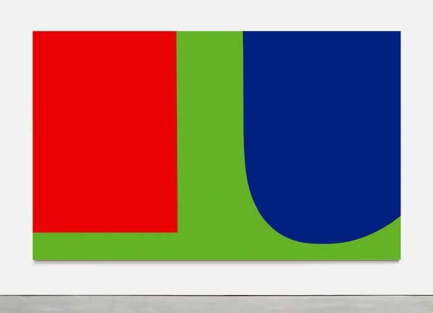
A powerful influence in shaping Mr. Indiana's work was that of Ellsworth Kelly, an early friend and mentor in New York, whose hard-edged style and sensuous use of pure, unaccented color made lasting impressions. In the show Mr. Indiana pays more conscious tribute to the influence of artists from the past: Charles Demuth and Marsden Hartley.
One of his biggest works imposes his own vocabulary on Demuth's well-known ''I Saw the Figure 5 in Gold'' (1928), an elegant combination of figures and abstract motifs that in turn is a tribute to the poet William Carlos Williams. In the Indiana version, ''The Demuth American Dream No. 5'' (1963), five black panels form a 12-by-12-foot cross. Each panel bears a circle fronted by a five-pointed star and a reproduction of the triple ''5'' in Demuth's work. A circular band within each of four circles repeats an Indiana catchword, ''err,'' ''die,'' ''eat'' and ''hug.''
Between 1989 and 1994, Mr. Indiana painted a series of 18 canvases inspired by the shapes and numbers in the ''war motifs'' paintings that Hartley -- who once worked in Vinalhaven -- did in Berlin between 1913-15. They commemorate a slain German officer the artist had befriended. One of the Indiana takeoffs, ''KvF XI,'' is shown here and it is an impressive exercise in translating a powerful and important piece of work from depths to shallows.
But for all the superficialities and repetitions of his work, it is of historical interest to see a full account of it. For better or for worse, it has influenced a younger generation of ''word'' artists like Jenny Holzer, Christopher Wool and Barbara Kruger, and at its best it has a jumpy vitality that registers the beat of American life. But once in 20 years is enough.
The City Review : Chief

"While coming to prominence during the 1960s as a Pop Artist, his concerns have always differed from those of his contemporaries. Where Warhol and Lichtenstein observed the dynamic of the mass media and the trappings of consumer culture, Indiana held more interest in national and cultural identity.His work revolves around a number of polarities: between personal and national identity; between socio-political upheaval and stasis. Chief is an outstanding example of Indiana's voice at the end of the 1960's. Displaying a highly graphic composition, together with a palette of rich, saturated color, the present work is typical of Indiana's production. The word 'Chief' anchors what appears to a sunset or sunrise.The word 'chief' refers to an Indian chief and, by extension, he asks us to debate the Indians' place within the contemporary American demographic. The sun rises and sets on a country thatis now very different for that section of the American populus."
The works of Robert Indiana - Various Sources:
The position of the four stars in 4-Star Love (two on top, two on bottom) prefigures the design of the artist's world-famous composition, Love. This format was a common feature of the artists' early paintings, many of which included circles or other geometric forms assembled in a square. The four stars in this painting appear to allude to a system of rating (as in restaurants and hotels) ranking the quality of love. The star has also been read as a symbol of America, nationalism, fame, or a self-portrait of the artist.
4-Star Love is a vibrant and significant painting that deepens our understanding of Robert Indiana's art and his place in American art history. The painting was donated to the Portland Museum of Art by Todd R. Brassner in memory of Doug Rosen, a close friend of Indiana' s and Long-time Vinalhaven resident who passed away in 1998.
The American Dream is the cornerstone of Indiana's mature work. The roots of this powerful concept pervaded the artist's Depression-era childhood, as well as the social and political aspirations of the United States during his formative years as an artist (1940s-1960s). It was the theme of his first major painting (sold to The Museum of Modern Art in 1961), as well as a series of works that continues to the present (the artist finished The Seventh American Dream in 1998). Indiana's process of reconstructing and redefining the American Dream has taken many forms: his political paintings, like The Confederacy: Alabama (1965); his literary paintings, like The Calumet (1961); and his autoportraits and investigations of celebrity and identity, like The Metamorphosis of Norma Jean Mortenson (1963-1967). (left: The Beware-Danger American Dream No. 4, 1963, oil on canvas, four panels, assembled: 102 1/4 x 102 1/4 inches, Hirshorn Museum and Sculpture Garden, Smithsonian Institution, Gift of Joseph H. Hirshorn Foundation)
The Portland Museum of Art recently announced the acquisition of an important early oil painting by Robert Indiana entitled 4-Star Love, which will be included in the exhibition. 4-Star Love is the first painting to include the word that would make Indiana a household name. This diminutive work is part of a series of small-scale paintings (12 x 11 1/8 inches) focused on single words (others in this series included paintings entitled Joy and Fun) the artist executed in 1961. These works, which the artist calls the "Bijoux" paintings, were exhibited in the early 1960s, and many entered private collections. 4-Star Love was acquired by Eleanor Ward, Indiana's dealer during the 1960s, and has not been shown publicly since that time.
The position of the four stars in 4-Star Love (two on top, two on bottom) prefigures the design of the artist's world-famous composition, Love. This format was a common feature of the artists' early paintings, many of which included circles or other geometric forms assembled in a square. The four stars in this painting appear to allude to a system of rating (as in restaurants and hotels) ranking the quality of love. The star has also been read as a symbol of America, nationalism, fame, or a self-portrait of the artist.
4-Star Love is a vibrant and significant painting that deepens our understanding of Robert Indiana's art and his place in American art history. The painting was donated to the Portland Museum of Art by Todd R. Brassner in memory of Doug Rosen, a close friend of Indiana' s and Long-time Vinalhaven resident who passed away in 1998.
Indiana also created one of the most widely recognized works of art in the world: Love. Despite the popularity of this image -- or perhaps because of it -- many critics have dismissed him as a designer, an opportunist, and a "one-hit-wonder." Much of Indiana's important contribution to American art has been overshadowed by the proliferation, pirating, and mass production of works bearing the image of "LOVE, " yet this is also a vital and important part of his career. Love is also part of the artist's rethinking of the American Dream, but because of its crucial importance in Indiana's career

ART REVIEW; Robert Indiana's Career: Love and American Style
It has been suggested that the dimming had to do with the mass popularity of his LOVE image, and its consequent rejection by his peers. (Actually, because LOVE was not copyrighted, he has failed to profit from the thousands of reproductions and knockoffs made from it.) In any case, in 1978, when the building he inhabited on Coenties Slip in Manhattan was sold, the artist -- born in New Castle, Ind., in 1928 and originally named Robert Clark -- removed himself to Vinalhaven, an island 15 miles off the coast of Maine. He has lived and worked there ever since.
In fact, this ''American painter of signs'' as he designates himself, has slipped so far out of the art-world orbit that the big retrospective now on view at the Portland Museum of Art, ''Love and the American Dream: The Art of Robert Indiana'' is his first major exhibition in this country for two decades. Covering 40 years of work, from 1958 to 1998, the show includes -- besides a representative group of his paintings -- the daily journals he kept during his early days in New York, an overly generous selection of his totemic sculptures made of discarded wooden beams and metal scraps, and a group of prints.
Of course, LOVE prevails. Mr. Indiana has put the logo through many paces -- some might say he's milked it dry -- and there are no less than 14 versions of it in the show. The biggest is ''The Love Cross'' (1968), a five-panel, 15-by-15-foot cross not T-shaped but with four symmetrical arms. Each of its sections bears the L word in its original design: two pairs of Roman capital letters with serifs, the first pair placed above the second. The letter ''O'' is tilted to the right, as if the foot of the L has given it a kick. In this particular work, the panels read successively right side up, upside down, and right to left, the letters in red on a blue ground. So active are the saturated colors that the whole has more of the impact of Op than Pop.
What this and certain other objects demonstrate, once again, is Mr. Indiana's considerable style as a graphic designer whose flat, posterish manipulation of words, symbols, colors and spaces -- positive and negative -- can be pleasing and provocative but also annoying with its stilted repetitiveness. At their best his designs reverberate, their elements bouncing off one other in dynamic relationships as they comment on the ups and downs of American life, his own included.
''The Beware -- Danger American Dream No. Four'' (1963), one of his ''American Dream'' series, takes cues from the ubiquitous American pinball machine. In gumdrop reds and yellows on a black ground, the number 4 and the words ''eat,'' ''tilt,'' ''jilt,'' ''jack,'' ''juke'' and ''the American dream'' are set in four circles, symmetrically deployed on a diamond-shaped panel.
It's a sardonic comment on the fantasy of riches, happiness, spiritual sustenance, and so on that besets us all, versus the chanciness of its realization, that has preoccupied Mr. Indiana for most of his career. At times he comes across as a corny revivalist preacher, as in ''Yield Brother II'' (1963), a giant road sign that shrieks its message in hot green, orange and blue; at others as a righteous political partisan, as in ''Alabama'' (1965), a comment on the civil-rights conflict, and then again as an observer of his own struggles.
The shorthand words and symbols that characterize his more public sentiments are also applied to his life: stars are used for self-reference; the words ''eat'' and ''die,'' usually seen in conjunction, refer to his mother's deathbed and her last words asking if he'd had something to eat. The rubric ''God is Love,'' we are told in the catalogue introduction by Aprile Gallant, curator of prints, drawings and photographs at the museum and the show's organizer, derives from its posting at the Christian Science church services he attended as a boy.
One of the few figurative renditions in the show, a pair of paintings titled ''Mother and Father,'' are painted ''snapshots'' of each parent standing separately next to a Model- T Ford, their own emblem of the American Dream. (His mother's state of undress, his father's bare legs and feet under his overcoat apparently refer to the artist's fantasy of having been conceived in such a car.)
A powerful influence in shaping Mr. Indiana's work was that of Ellsworth Kelly, an early friend and mentor in New York, whose hard-edged style and sensuous use of pure, unaccented color made lasting impressions. In the show Mr. Indiana pays more conscious tribute to the influence of artists from the past: Charles Demuth and Marsden Hartley.
Red Blue Green, Ellsworth Kelly, 1963
One of his biggest works imposes his own vocabulary on Demuth's well-known ''I Saw the Figure 5 in Gold'' (1928), an elegant combination of figures and abstract motifs that in turn is a tribute to the poet William Carlos Williams. In the Indiana version, ''The Demuth American Dream No. 5'' (1963), five black panels form a 12-by-12-foot cross. Each panel bears a circle fronted by a five-pointed star and a reproduction of the triple ''5'' in Demuth's work. A circular band within each of four circles repeats an Indiana catchword, ''err,'' ''die,'' ''eat'' and ''hug.''
Between 1989 and 1994, Mr. Indiana painted a series of 18 canvases inspired by the shapes and numbers in the ''war motifs'' paintings that Hartley -- who once worked in Vinalhaven -- did in Berlin between 1913-15. They commemorate a slain German officer the artist had befriended. One of the Indiana takeoffs, ''KvF XI,'' is shown here and it is an impressive exercise in translating a powerful and important piece of work from depths to shallows.
But for all the superficialities and repetitions of his work, it is of historical interest to see a full account of it. For better or for worse, it has influenced a younger generation of ''word'' artists like Jenny Holzer, Christopher Wool and Barbara Kruger, and at its best it has a jumpy vitality that registers the beat of American life. But once in 20 years is enough.
The works of Robert Indiana - Various Sources:
Monday, 17 October 2011


Saturday, 15 October 2011


Energy - Concepts
Been working on some concepts for 'Energy' today. A typographical approach (well part-typo) and a more literal approach.


Thursday, 13 October 2011
Subscribe to:
Posts (Atom)